London Transit App Redesign
Inspiration
The London Transit Commission (LTC) website offers two trip-planning
applications that give the user two different sets of route data.
One LTC app uses inputted addresses to give the user a custom trip with information about transfers, walking etc. The other LTC application provides the user
with information about a specific bus route in real-time, such as nearby routes, nearby stops,
current bus capacity, accurate arrival times etc.
As a team, we challenged ourselves to redesign the originally unintuitive interfaces to
improve the flow and usability of trip-planning.
Our goal was to combine both applications into a single environment where the
user can have the benefits of both the address-based Google Maps trip-planner and the LTC real-time interface.
Description
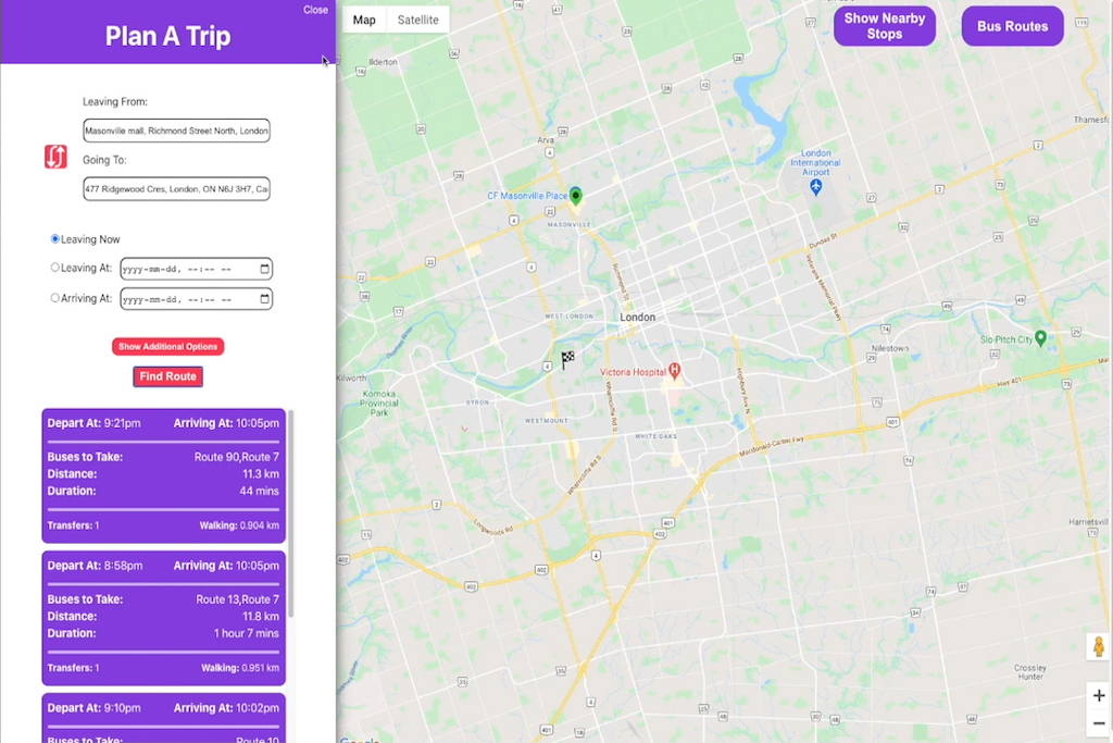
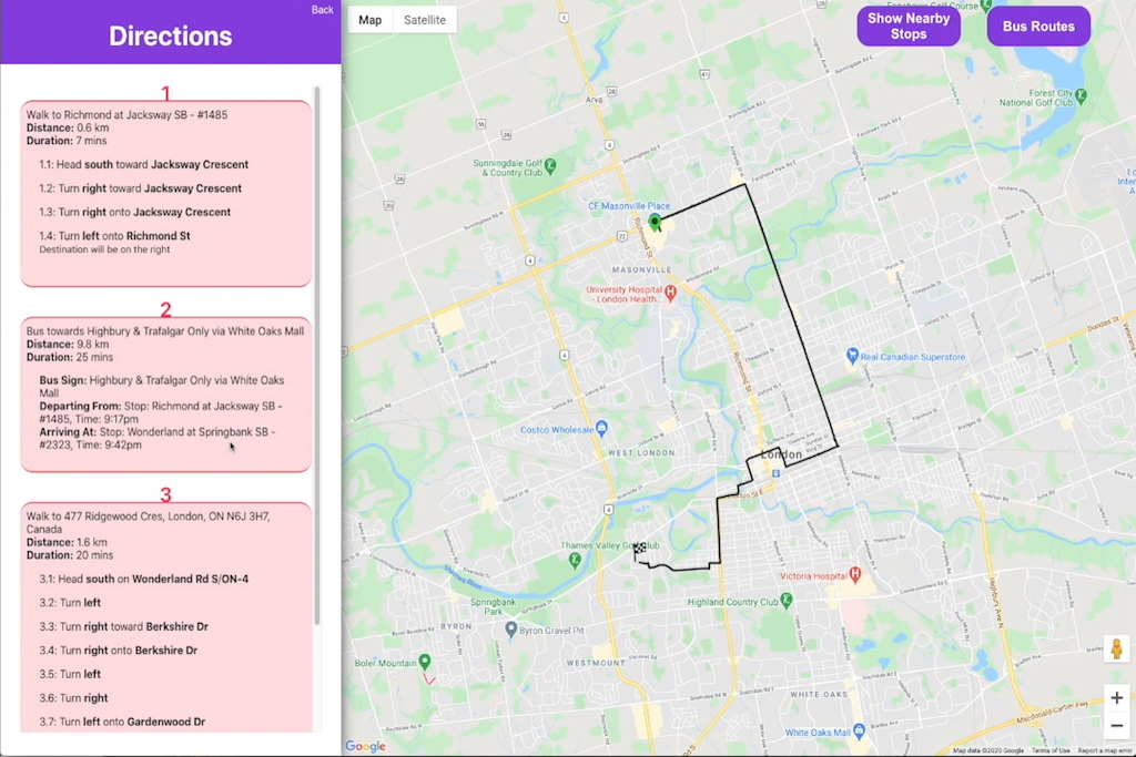
The Plan A Trip interface uses LTC's real-time bus data and a Google Maps API to find the best route options. When the user opens the Plan A Trip tab, they are prompted to enter a source and destination address by typing it out or clicking on the map. They can decide what time they would like to leave or arrive and whether they want to minimize walking or transfers before they click Find Route. Once they do, the user will have different route options, each complete with important information about departure/arrival times, distance, duration, and transfers.


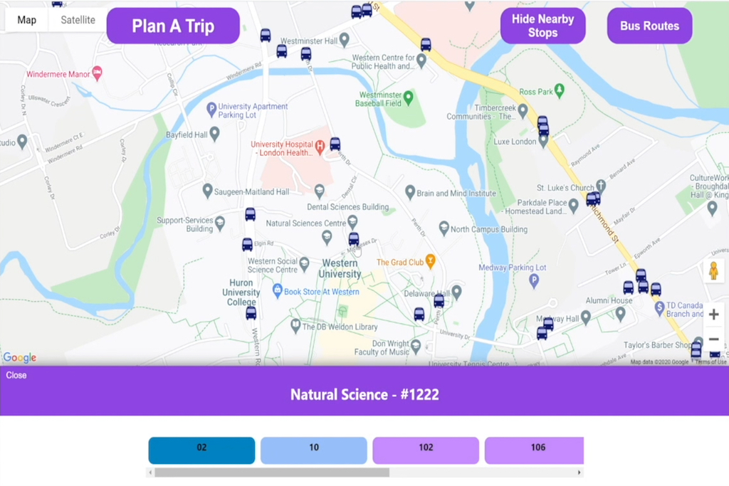
It also caters to users with different levels of expertise in the local transit system. If a user is familiar with London and knows the path of different busses, they can simply press the Show Nearby Stops button to reveal all bus stops near them. For example, the stop clicked in the example below was the Natural Science stop. Since the busses that stop here include Bus Route 02, Bus Route 10, Bus Route 102, Bus Route 106 etc., the user knows that they have those bus route options at that particular stop.
However, if the user wants to view a bus route, they can select the Bus Routes button, which opens a new tab containing all the active routes in the area. Each route is distinguished with a unique colour, and the user can click the route to view the bus route's path on the map in its designated colour.


This application successfully and conveniently consolidates the information found from both LTC web apps into a single intuitive interface. It improves upon the original design by making the available functionality obvious and intuitive for the user. The buttons are large enough to stand out, and they are conveniently placed near the interface's top border to make it easy for the user to home in on them. The colours are consistent to help the user distinguish main actions from sub-menu actions. Helpful features such as autofill, hover tooltips, and descriptive error messages have also been included in the new design.
Development
My team started by identifying problem areas in the original application and strategies to improve them by considering user needs. Once we had a few features we knew we wanted to redesign, the team conceptualized the interface. During development, we worked primarily with JavaScript, React.js, CSS, and TypeScript. We relied on API calls to facilitate actions throughout the application. As a designer and developer on this project, I worked with both the front-end user experience and the back-end functionality.
To better understand the redesigned application, check out the walkthrough analysis video above. The code can be found on GitHub.